Blue Art Studio is a charming small business in Switzerland specializing in the sale of ceramics. Owned by Jannis Smith, the studio aspires to reach a broader audience and begin offering ceramic classes. Jannis's mission is to share the joy of creating ceramics while ensuring a seamless shopping experience for her customers. However, the current website poses several challenges and improving these aspects is crucial to enhancing user experience and achieving Jannis's goals.


Typography & Color Scheme
-
Yellow text on blue or light backgrounds causes visual strain and compromises legibility.
-
Readability depends on strong contrast between text and background to reduce eye fatigue.
-
Cool-toned periwinkle works with dark blue but clashes with warm mustard yellow, creating inconsistent color temperature.
-
The mix of cool and warm tones disrupts visual harmony and undermines aesthetic cohesion.
-
The overall design lacks a clear call to action.
Lost In Translation
-
The design does not translate well to mobile devices.
-
The header is oversized and does not stay fixed at the top, making navigation difficult.
-
The overall structure feels disjointed.
-
The header image loses its visual impact on smaller screens.
-
The accompanying text is too large and overwhelms the screen.
Design and Usability Issues
-
Light gray text lacks sufficient contrast against the pale periwinkle background, making it hard to read and not accessible, especially at smaller sizes.
-
The page contains too much text that isn’t well-organized, leading to information overload and poor readability.
-
On desktop, images are too small to view clearly without clicking.
-
When clicked, images expand to fill the entire screen, which can feel disorienting.
-
Image placement is awkward—they appear side by side at the bottom, feeling disconnected from the main content.


User Testing
Test Objectives
-
Evaluate Ease of navigation and readability
-
Identify visual and functional barriers
-
Measure how easily users can browse, shop, and find ceramic class information
-
Gather qualitative feedback on design appeal and clarity
I recruited six participants for the study, three local residents and three international users, to reflect a diverse customer base. Each participant was asked to complete tasks, including adding ceramic items to the cart and attempting to sign up for a class. The group consisted of four women and two men.
Task Summary
& SUCCESS RATE
Add ceramic item to cart
2/6

Find info/register for ceramic classes
5/6
Read Product Description
3/6
Navigate to contact information
6/6
Mobile Usability
2/6
FEEDBACK
-
"I wanted to zoom in a little not have the pictures take over my entire screen."
-
"I would've thought classes would be easier to register for, turns out i have to send the email myself."
-
"I couldn't even see the individual products it looks like i would have to visit the store to understand what i am buying."
-
"Immediately so confusing, I can't even register anything on my phone."
Conclusion
User feedback reveals key usability issues:
-
Image interaction is frustrating, users expect a simple zoom, not full-screen takeover.
-
Registration is confusing and too manual; users want an easier, automated process.
-
Product display lacks clarity, pushing users to consider visiting in person.
-
Mobile experience is poor, with key features like registration not working properly.
These highlight the need for better UX design, clearer product presentation, streamlined workflows, and full mobile optimization.
Persona

JANNIS SMITH
Background
Jannis, a 55-year-old nanny, lives in a quiet suburban town about 40 minutes outside the nearest city. Recently, she opened her own ceramics studio, hoping to grow it into both a creative learning space and a destination for purchasing original handmade pieces. To help build her online presence and attract more customers, Jannis hired a marketing agency to support her studio’s growth.
Problem
Jannis has yet to gain traction dispite her actively trying both online and in person. Many of her friends have advised her to try a different company for a new website due to the issues they experienced on her site.
Needs
-
A functional user friendly site
-
Clearer calls to action
-
Mobile responsiveness
Solution
-
Website redesign
-
Simple navigation
-
Booking system
-
Strengthened brand identity
WireFrames
Starting with wireframes I iterated through several versions until I landed on a layout that aligned with the site’s theme. The final structure includes an intuitive navigation, clearly labeled tools and menu items, and a logical flow designed to guide users through the website. During this stage I also explored new color schemes for the site, drawing inspiration from the ceramic pieces displayed.
Process


Final Design


Why is this the Final Design
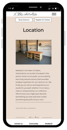
Mobile Usability Enhancements
-
Focused on fixing key issues identified during user testing.
-
Improved image responsiveness to ensure smooth transitions from desktop to mobile.
-
Introduced clear and prominent call-to-action buttons to guide users effectively.
-
Reduced text-heavy sections and refined color scheme and typography for better readability and aesthetic appeal.
Streamlined User Journey
-
Added a direct path for users to sign up for classes, removing the extra step of initiating contact manually.
Desktop Experience Enhancements
-
Refined the site’s structure to create a smoother, more intuitive flow.
-
Emphasized strategic placement of call-to-action elements for clarity and engagement.
-
Incorporated visuals of all available products to enhance browsing and support purchasing decisions.
-
Introduced a new color scheme featuring neutral earth tones that complement the ceramics without competing with their natural vibrancy.